I led end-to-end redesign to build the next-gen management system
Type
B2B, Dashboard, System Overhaul
Role
Project Lead
Product Designer
UX Researcher
Team
Team: Visual Designer, PM
Duration
2023-2024
Client
ALP OMEGA
Platform
Mobile App Dashboard
Stakeholder
CEO
Team Leads
PM

I successfully increased efficiency at global scale
hours saved for the workforce
global facilities deployed
front-line staff served
Global markets served
"The redesigned system dramatically improved our coordination and efficiency."

Claire Hung
Product Manager, ALP
Research
I visited warehouse floors to uncover real problems

How the floor actually operates
Loading, unloading, automated stacking, and manual pickup processes.

What staff struggle with daily
Warehouse staff, product manager, warehouse manager.

Where the old system breaks down
Three different warehouse screens and app use cases.
Key Findings
Root cause: The system wasn't built for speed.

Critical data spread across 7 app screens

Dashboards unreadable from working distance
Shipped in 2025
CRM Sales System
I shipped 2 enterprise features impacting 1M+ users in 3 months

Duration
2025.05-08
Role
Product Designer Intern
Team
PM
Design Director
Senior Designers
India-Based Engineers
Platform
Salesforce Sales Cloud System

Key Feature 1
Everything critical in one view
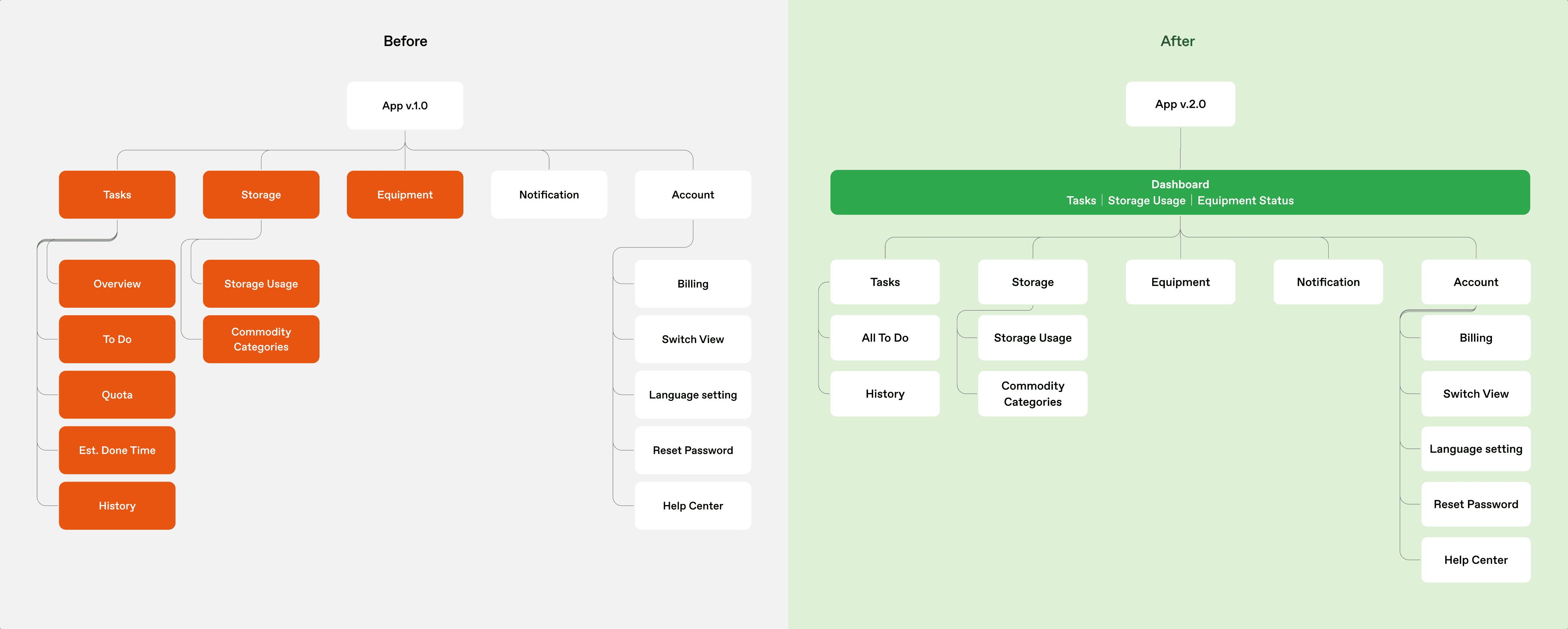
Before
Seven screens. Zero overview.
Staff navigated 7 different pages for essential information. Constant context switching with no complete operational picture.

Challenge
How to balance eight stakeholder's data priorities while maximize speed?
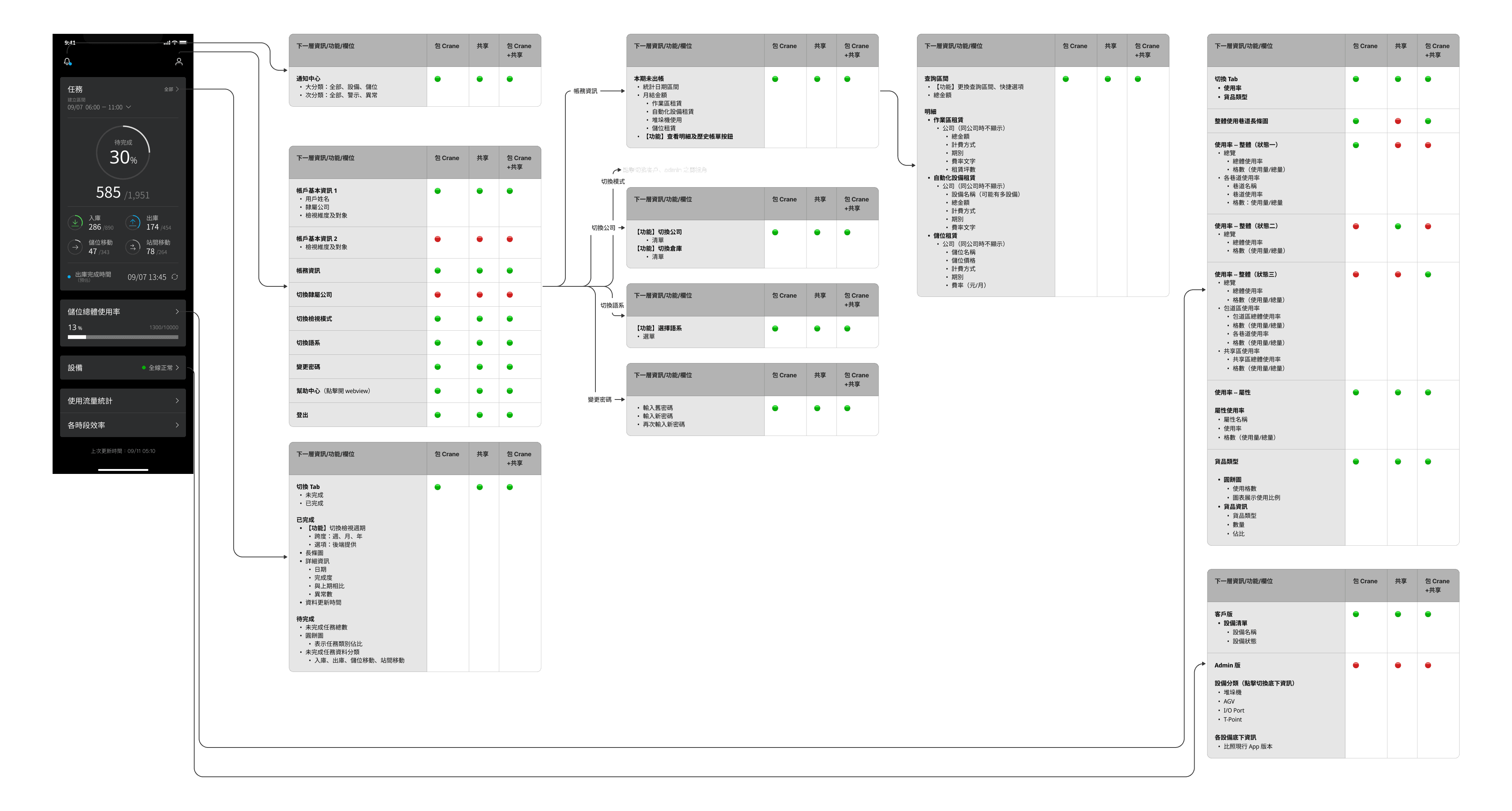
Each stakeholder level required distinct data depth and metrics across the system. Floor staff needed granular task data while executives needed aggregated insights.
Executive Team
High-level KPIs and trends
Floor Managers
Real-time floor activity
Operation Team
Check real-time progress
Hardware Team
Equipment status and alerts
Software Team
System health and uptime
Sales Team
Delivery performances
Client Managers
Real-time progress tracking
Client Supply Team
Inventory delivery tracking
Key Decision 1
I unified all critical metrics by redesigning the architecture
The new home screen consolidates the 7-screen workflow into a single 'Control Tower' view.
Key Decision 2
I reorganized data hierarchy, prioritizing
Through interview, I found urgent information matters to all teams: alerts first, progress second, storage third, analytics last. Staff can now see task progress, storage capacity, and equipment alerts instantly.
The Design
Everything critical in one view, no more juggling
The new home screen consolidates the 7-screen workflow into a single 'Control Tower' view.
Normal State
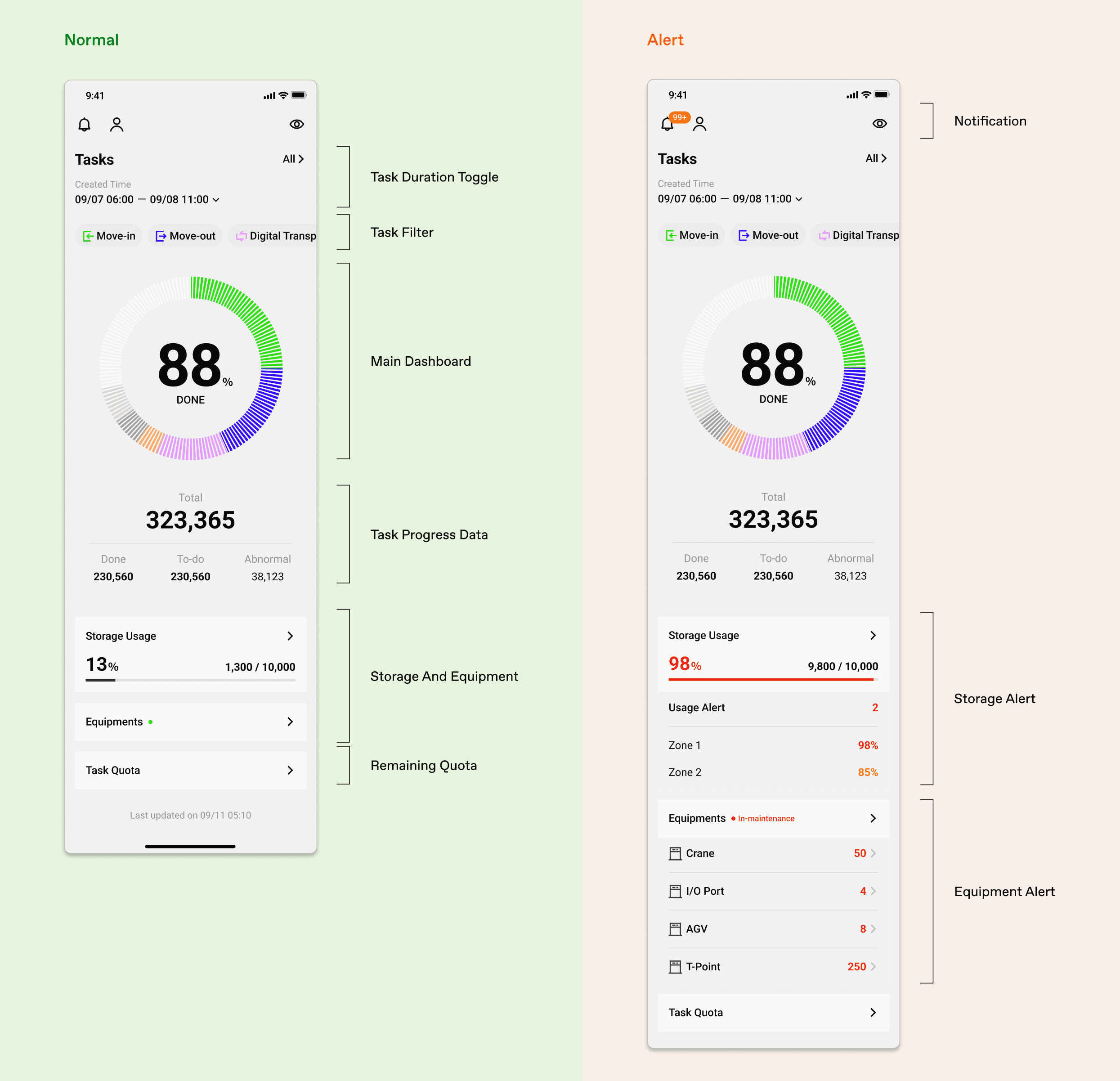
Alert State

Impact
“The redesigned system ensures perfect information sync across all key warehouse users.”
Claire Hung
Product Manager, ALP

Key Feature 2
Alerts first, everything else follows
Before
Staff can't read dashboard from distances and in bright lighting
Mounted 5-10 meters above the warehouse floor, the existing dashboard's small text and low-contrast alerts became invisible in bright lighting conditions, preventing staff from catching critical issues.
Challenge
How to ensure instant visibility in across varying lighting conditions?
Warehouse operations demand instant decision-making. Staff viewing dashboards from 5-10 meters away must process critical alerts while navigating between bright sunlit areas and dimmer storage zones.
Alert Visibility
Urgent alerts must stand out instantly
Font Legibility
Fonts large enough for quick reading
Data Hierarchy
Prioritize data by clear visual hierarchy
Varying Lighting Conditions
Visibility across all corners
The Design 1
Alerts and progress first, with clear hierarchy for instant visibility
Normal status fades to the background, but critical alerts snap to the top left the moment they appear—eliminating the scan-and-search delay when every second counts.
The Design 2
Light mode for bright areas, dark mode for low-light zones
Light Mode: Prevents washout in bright, sunlit loading docks.
Dark Mode: Reduces glare and eye strain in lower-light storage zones.

Key Learnings
Ruthless prioritization is the key to serve multiple stakeholders
The breakthrough came when I stopped asking "whose data first?" and started asking "what's most urgent?" In complex B2B systems, organize by operational need — not by who asks loudest.
Designing for physical displays and real workflows requires being there
The brief said "visual updates." But on the warehouse floor, I found alerts lost in navigation, text illegible at 3 feet, and screens unusable under strong light. You can't design for physical environments from a desk.

