Shipped in 2024
From Bottleneck to Backbone
A redesign that saved 1M+ workforce hours across 14 global warehouses
Timeline
2023-2024
Role
Project Lead
Product Designer
UX Researcher
Platform
Mobile App Dashboard
Stakeholder
CEO
Team Leads
PM
Client
ALP OMEGA
⦿ TL;DR
The system no one trusted
became the one everyone relies on
1 million+
hours saved for the workforce
140,000+
front-line staff served
14
global facilities deployed
"The redesigned system dramatically improved our coordination and efficiency."

Claire Hung
Product Manager, ALP
❖ Context
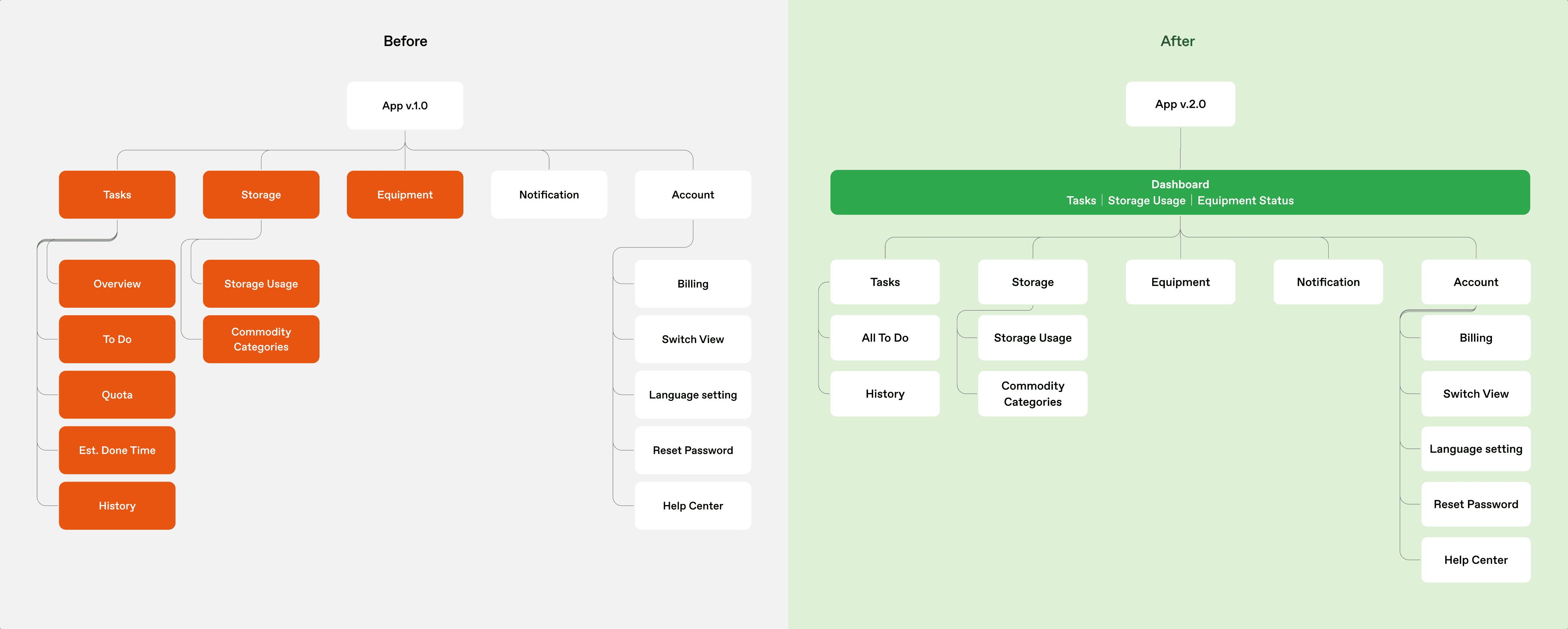
Warehouse staff needed seven pages to find a problem.
Ten minutes to fix it.
✕ User Pain
"I have to jump between 7 app pages to figure out the cause, when something's wrong. "
— warehouse staff feedback
The legacy system was slowing everything down.


"The lights cause glare on dashboards, and
I can't read the small fonts from 3 feet away."
— package staff feedback
Critical alerts went unnoticed because staff couldn't read the screen.

$ Business Concern
The industry standard error response is 3 minutes
— ALP needed 10.
3.3x slower than industry standard. The system was the bottleneck


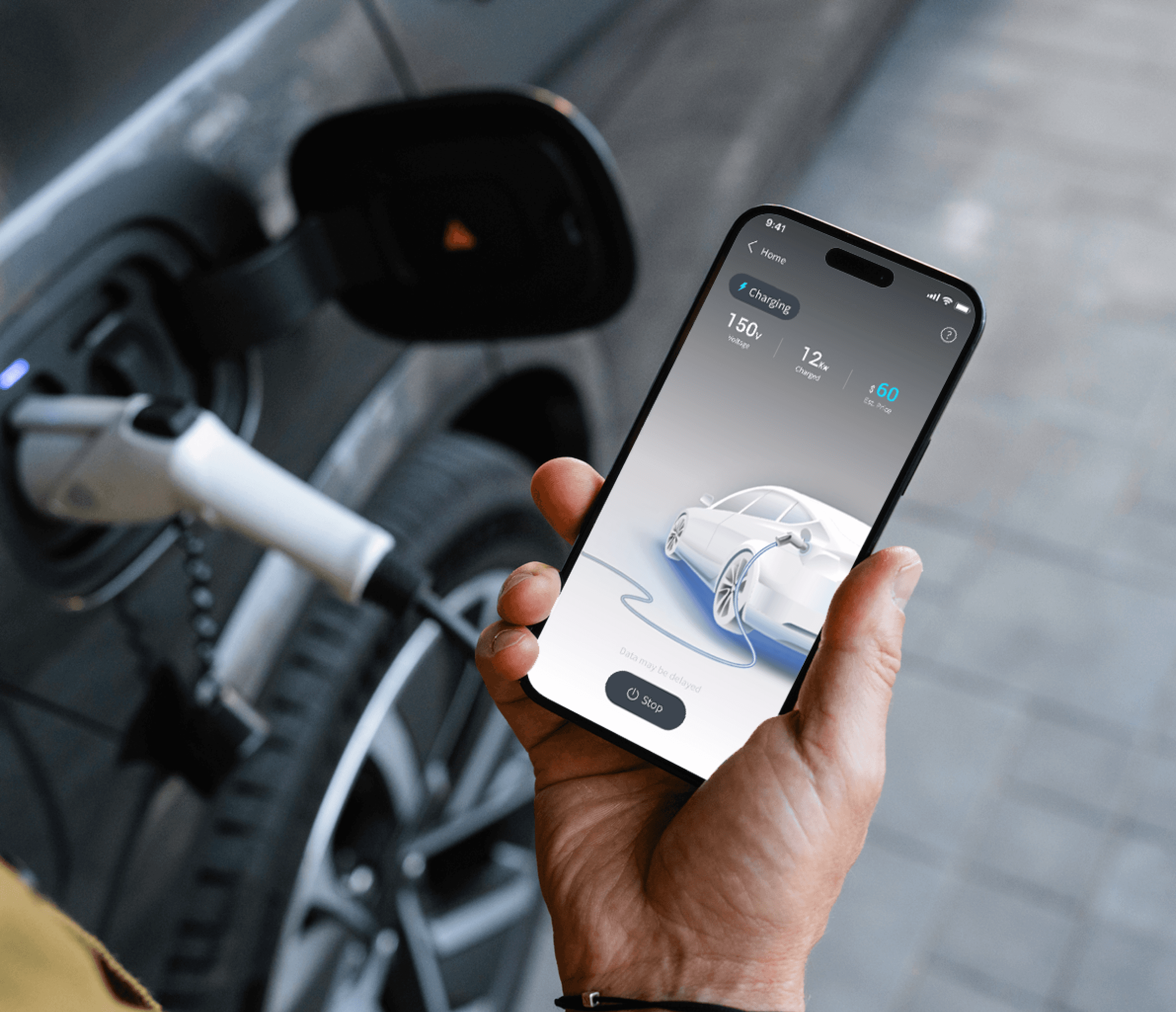
❊ Solution
Built for urgency and clarity
across both screens

Everything critical on one page, no more juggling
Tasks, capacity, and delays — all visible at once. Organized by urgency, not by team territory.
Dynamic Layout surfaces alerts instantly
Critical alerts snap to the top left the moment they appear. No scanning, no searching.
Dual-Mode Display adapts to every corner of the warehouse
Light mode for bright, sunlit loading docks. Dark mode for lower-light storage zones. Readable in every corner.
Full Story
⦿ Research
"What's causing the delays?"
I went to the warehouse floor to find out

How the floor actually operates

What staff struggle with daily

Where the old system breaks down
Root cause: The system wasn't built for speed.

Critical data spread across 7 app screens

Dashboards unreadable from working distance

Key Feature 1
Everything critical in one view
◎ Context
It took 7 pages to answer one question: What's wrong?
The app grew with the org — every new team added new pages. No one simplified, so the system got slower and layered

❖ Challenge
Everyone needed clarity.
But 8 stakeholder groups meant 8 definitions of it
The Hard Question: Whose data should come first, when everyone's answer is "mine"?

↔︎ Key Decision 1
I first found what everyone cares about: progress, capacity, and alerts
Task progress, storage capacity, and alerts matter to everyone. That became the homepage elements.
↔︎ Key decision 2
Second, I structured hierarchy by urgency
Alerts first, progress second, storage third, analytics last.
Impact
“The redesigned system ensures perfect information sync across all key warehouse users.”
Claire Hung
Product Manager, ALP

Key Feature 2
Alerts first, everything else follows
◎ Context
Unreadable from 3 feet away
Small text, low contrast, bright lighting. Mounted dashboards invisible to staff on the floor.
❖ Challenge
Need to be visible in any light, any distance
How do you fix visibility across an entire warehouse — without replacing a single screen?

↔︎ Key Decision 1
Dynamic Layout surfaces alerts instantly
Critical alerts snap to the top left the moment they appear. No scanning, no searching.
↔︎ Key Decision 2
Dual-Mode Display adapts to every corner of the warehouse
Light mode for bright, sunlit loading docks. Dark mode for lower-light storage zones. Readable in every corner.

Key Learnings